Understanding
The Timing Arrays provides a graphical representation of several independent proprietary time-based models designed to identify potential changes in market trends, turning points and volatility along different time periods (daily, weekly, monthly). The Forecast Arrays are sometimes referred to as Timing Arrays – or just the Arrays.
Each row in the Array table reflects an output of proprietary models – some have over 70 actual separate models behind the scenes.
Each column reflects a time unit within the time period you are researching (daily, weekly, monthly).
The size of a bar in each column and row increases based on the strength of the cycles behind the scenes identifying a potential turning point in trend, price or volatility on that day, week or month. We highly recommend aligning your research of Arrays (potential timing) with Reversals (potential price points).
Turning points in price (high or low) unfold on both the highest and lowest bars. There is no direct relationship between turning points and highs and lows in the array. A low in price may unfold with the highest plot and a high could form on the lowest plot or vice versa.
With the exception of the Trading Cycle indicator, each model is designed only to provide an indication of when the market will change trend at a specific point in time.
Below is a brief explanation of each model (row) displayed in the Arrays:
Aggregate
Aggregate Model is the combination of all models converged to provide potentially important dates ahead.
- The height of the bars vary based on the number of models converging in that unit of time (day, week, month). All the bars are standardized to the largest bar. The color of the bars in the Aggregate row are blue if greater than the previous bar and pink if less than the previous bar.
- Important to understand that Aggregate bar peaks or troughs represent the potential for a market high or a low, but bar peaks aren’t necessarily market highs, and bar troughs aren’t necessarily market lows.
- Turning Points tend to alternate with Aggregate peaks/troughs, so if one Aggregate peak/trough renders a high, then the following Aggregate peak/trough will tend to render a low, and so on.
- If you see multiple Aggregate peaks over a short period of time, this will tend to indicate that market price may be choppy with frequent alternating highs and lows.
- Troughs in the Aggregate row will appear as the lowest pink bars, and they reflect a lack of synergy in its components.
In summary: the highest bars in the Aggregate row reflect the greatest synergy of the models and indicate when potential Turning Points are most likely to occur.
Note: Aggregate is sometimes referred to as Composite
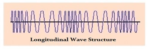
L-Wave
The L-Wave Timing Model is longitudinal based, which expand and contract through time. The cyclical frequencies are based upon the computer model’s interpretation of the market’s cyclical pattern.
Note: L-Wave is sometimes referred to as Comp II or Composite II
Empirical
The Empirical Timing Models are hard wired insofar as the frequencies are fixed.
This model has been developed through years of research, and are unique to each market.
Long Term
The Long-Term Timing Models have fixed frequencies which are typically three times the duration of the normal Empirical Timing Models, and are similarly unique to each market.
Trading Cycle
The Trading Timing Model offers a union of time and direction by counting time units (e.g. days, weeks, months) until a potential trend correction or convergence is seen.
- Bullish cycle counts are GREEN 7, 11, 14 and 21
- Bearish cycle counts are RED 2, 3, 5, 6 (panic), 10, 12 (panic), 18
- Yellow bars represent a convergence of bull and bear cycles
Green bars indicate a potentially ideal time for highs to unfold, whereas red bars indicate a potentially ideal time for lows to unfold, and yellow bars indicate a potential convergence of at least one bull and bear cycle, translating to the potential for a high and a low to take place during the same time interval. The more cycle counts that converge on a particular day, the larger the bar will be.
Directional Change
A Directional Change does not need to be an actual high or low in the market. Instead, it is the target where the market may begin to make a decisive move. During periods of high volatility, it is likely that the turning point and directional change will converge in the same time period. This tends to occur when a market is making a spike high or low.
For example, it is possible to find the intraday high or low take place 1 to 3-time units (days, weeks, months, etc.) preceding the DC target. On a weekly level, the actual high might form on Wednesday while the market moves sideways within a narrow trading band until the DC comes into play, perhaps the following week.
Panic Cycle
The Panic Cycle Models identify potential timing of abrupt, possibly dramatic price movement. A Panic Cycle differs from a turning point or a directional change insofar as it does not necessarily reflect a high or low, nor is it attempting to reflect the beginning of a change in trend.
We’ve observed that approximately 70% of the time, a Panic Cycle has been an outside reversal (e.g. price exceeding the previous session high while also penetrating its low), or capitulation, whereas approximately 30% of the time it has been a relatively fast one way move.
(Note: the use of the term ‘reversal’ in the phrase ‘outside reversal’ has absolutely no relation to the "Reversals" from the proprietary Reversal System available in Socrates – it simply refers to a dramatic price move in which a market price exceeds the previous session high while also penetrating its low ).
Volatility (Internal and Overnight)
The Volatility Models provides an indication for when a change in the current volatility trend may take place. Volatility is only concerned with percentage movement, rather than the direction or whether it is a high or low. The targets in this model reflect potential turning points, but in volatility terms – thus, the low in volatility might form on the highest bar while the high in volatility could unfold on the lowest bar.
Volatility is measured in three primary manners: internal (difference between high/low of trading session), overnight (previous close to open), and general volatility (close to close).